July 12 / 2023
Monsters Reveal New Brand Identity with Evolved Colors, Logos and Marks
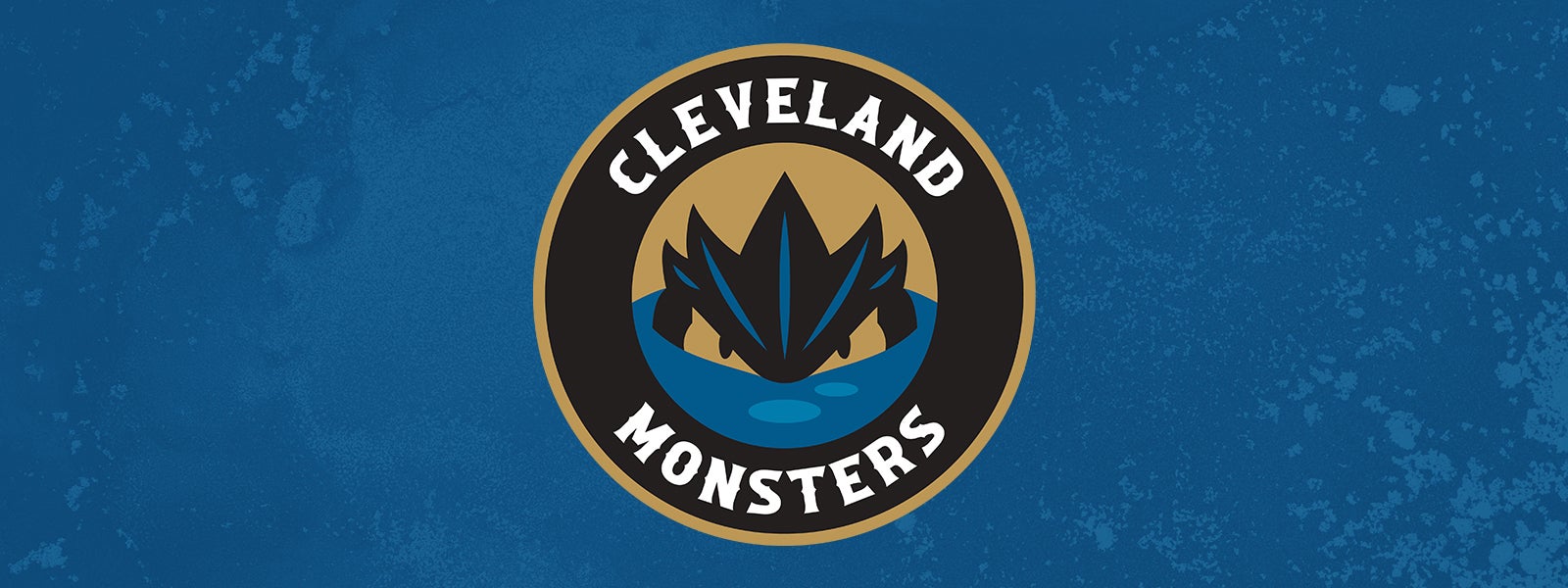
The Cleveland Monsters officially introduced new marks and colors today in the team’s most significant visual evolution in its 16-year history,inspired by Lake Erie lore, Cleveland’s rich hockey history and the franchise’s bold and fierce namesake. The Monsters will reveal additional on-ice brand details for the 2023-24 season during a special event for Monsters Hockey Club members and stakeholders on Wednesday night at Rocket Mortgage FieldHouse.
The official launch of the next chapter of Monsters hockey is the culmination of a multi-year process led entirely by an internal team of brand managers and graphic designers from Rock Entertainment Group. Designed to reflect the Monsters’ unique brand positioning in Cleveland and the American Hockey League, the new logo set and its simplified palette clearly defines Monsters colors as black, blue, and gold. The wordmark features a new typeface with nautical inspiration, also featured in the primary logo and containing the tailed M.
“Black and Blue Hockey is about more than just the evolution of our colors,” said Monsters Sr. Vice President and Chief Marketing Officer Ben Adams. “It’s about the brand of hockey played by our Monsters and the toughness of the city this team represents.”
The new primary logo proudly leads with Cleveland arched above the Monster, which is seen head-on, symbolizing the organization’s relentless pursuit of success on and off the ice. The secondary icon features the familiar silhouette of the lurking Monster, which has adorned the team’s jerseys for 16 years, in a new simplified color palette. The tertiary mark reintroduces an ‘M’ to the brand with a tail that is a nod to what might lie below the surface in the depths of Lake Erie.
The new, simplified palette solidifies the team colors as the ones that have most prominently been featured in the Monsters logo over the years. Bessie Black is a direct reference to the Monster itself, while Lake Blue is inspired by the waters it lurks in. The selection of blue also pays homage to Cleveland’s championship legacy as it was the predominant color worn by the Cleveland Barons, nine-time winners of the Calder Cup from 1937-1973. The color palette is completed with a new and unique shade of gold.
“We are incredibly fortunate to usher in this evolution of the Monsters brand from a position of strength coming off a season where we saw incredible growth across our entire business,” said Monsters President Mike Ostrowski. “Cleveland’s continued interest in Monsters Hockey coupled with the expectation from our great fans to always be innovative and creative made it the perfect time to unleash this new look, and we couldn’t be more excited to see it in action for the upcoming season.”
A selection of new branded merchandise including sweatshirts, shirts, hats and novelty items is available now at MonstersTeamShop.com while supplies last. Orders placed online are expected to be processed within 3-5 days. Monsters Hockey Club members in attendance at Wednesday’s event will have the exclusive opportunity to shop the full collection of new branded merchandise at the state-of-the-art and recently transformed Center Ice Team Shop inside Rocket Mortgage FieldHouse. The official team shop of the Cleveland Monsters has an expanded, dedicated Monsters zone on the store’s second floor, providing more Monsters merchandise options for fans. The full Black and Blue Hockey Collection will be available to the public on Thursday, July 13, at 10:00 a.m. both online and at Center Ice.